Color Matching on Printed Plastic Cards: Getting It Right
Table of Contents []
- Color Matching on Printed Plastic Cards: Why It Matters More Than You Think - Plastic Card ID
- Understanding the Color Matching Challenge on Plastic Card Substrates
- Printer Selection and Its Direct Impact on Color Accuracy
- Ribbon Configuration and Color Panel Choices
- Design File Preparation for Color-Accurate Card Printing
- Color Matching Across Card Types and Special Applications
- Getting Color Matching Right the First Time with Plastic Card ID
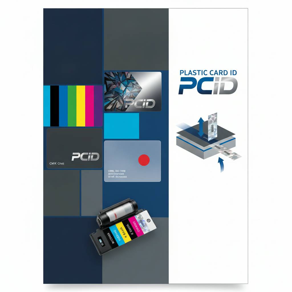
Color Matching on Printed Plastic Cards: Why It Matters More Than You Think - Plastic Card ID
Hand someone a plastic card that looks off - a logo that feels muddy, a background color that clashes with what they see on your website, a gradient that went flat somewhere between your design file and the finished card - and something quietly shifts. Trust erodes. Not dramatically. Just a small, almost subconscious signal that the brand behind this card doesn't quite have its act together. That's the real cost of ignoring color matching on printed plastic cards, and it's a cost most organizations don't even realize they're paying.
Color accuracy on plastic is its own discipline. It is not the same as printing on paper, fabric, or any other substrate. The surface, the inks, the encoding layers, the lamination - every variable pulls color in a direction. Getting it right requires the right cards, the right printer, the right ribbons, and honestly, a supplier who has been solving this problem for clients across the United States for over 25 years. That's exactly where CPE comes in.
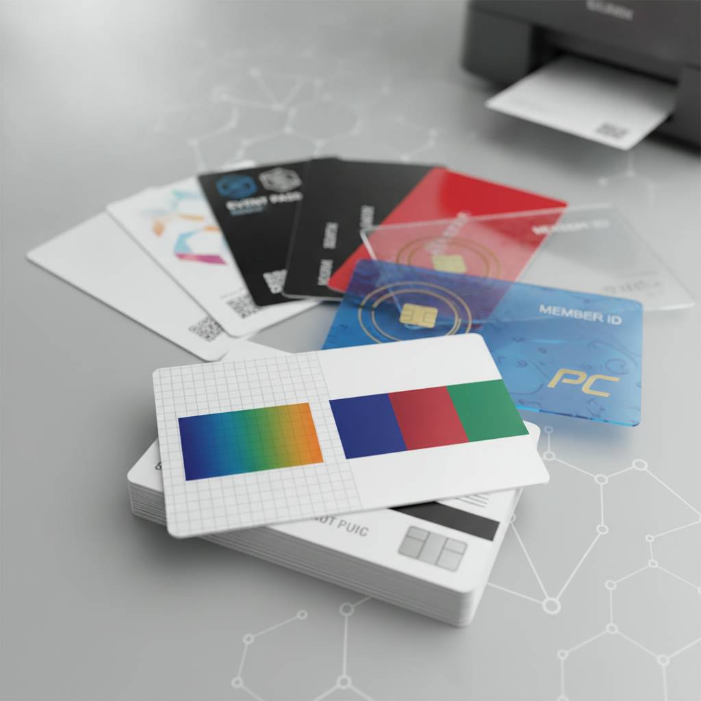
| Card Type | Color Matching Consideration | Best Use Case |
|---|---|---|
| Blank White PVC CR80 | Neutral base ensures truest color output | Employee IDs, loyalty cards, membership cards |
| Colored Stock PVC Cards | Base color blends with printed ink layers | Brand-matched cards, event credentials |
| Clear / Frosted PVC Cards | Translucency affects perceived color depth | Premium membership, VIP passes |
| Magnetic Stripe Cards | Stripe placement must align with design zones | Gift cards, hotel keys, access cards |
| Smart Chip / RFID Cards | Chip position affects printable design area | Access control, casino player cards |
Understanding the Color Matching Challenge on Plastic Card Substrates
 Plastic cards are printed using dye-sublimation or thermal transfer technology - processes that behave very differently from the inkjet or offset printing most graphic designers are trained on. Colors that look perfect on screen can shift dramatically when translated onto PVC through a ribbon-based print system. The substrate itself - whether it's glossy white, matte frosted, translucent clear, or a pre-colored stock - acts as a filter that modifies every layer of color placed on top of it.
This isn't a flaw in the process. It's simply physics. Understanding it is the first step toward achieving the color fidelity that makes a plastic card look like it was designed to be a card, not just printed on one. When you account for substrate behavior from the start of the design process, the results are consistently excellent. When you ignore it, you spend time and money on reprints.
How Substrate Color Affects Printed Output
A white CR80 card is the gold standard base for color matching because it provides a neutral foundation. The dyes bond to the white surface and render at something close to their intended values. Introduce a colored substrate - a blue or red stock card, for instance - and every color you print over it is now interacting with that base. Yellows may go green. Light grays may vanish entirely. Design decisions must account for the card's base color before a single element is placed.
Clear and frosted cards add another layer of complexity. Because these substrates are translucent, colors print with less opacity, and darker backgrounds or wallet linings can show through. This is actually a design advantage when used intentionally - a frosted card with a cleanly printed logo can look extraordinarily premium - but it requires advance planning and often a test print run before committing to volume.
Dye-Sublimation vs. Thermal Transfer: What Changes for Color
Dye-sublimation, the method used in most YMCKO ribbon configurations, produces smooth gradients and photographic-quality color because the dye diffuses into the card surface at a molecular level. The result is vivid, continuous-tone color that handles skin tones, logos, and backgrounds beautifully. This is the preferred method for high-visual-quality ID cards, loyalty cards, and anything with photographic elements.
Thermal transfer, by contrast, deposits a solid layer of ink onto the surface rather than diffusing it. Colors are more opaque and consistent across flat areas, which makes it ideal for bold logo-driven designs where solid color blocks need to hold their value precisely. Choosing the right ribbon type for your design intent is as important as the design itself, and it's something CPE can help clients navigate before orders are placed.
The Role of Lamination in Final Color Appearance
Lamination overlay panels - the clear "O" layer in a YMCKO ribbon - protect printed color and simultaneously affect how that color is perceived. A glossy overlay deepens saturation and makes colors appear richer and more vibrant. A matte overlay softens the same colors and gives them a refined, almost luxury appearance. Neither is wrong. They are tools, and choosing the right overlay finish is a color decision as much as a design one.
Some printers support specialty overlays including holographic laminates or spot-UV type effects that add visual complexity without altering the underlying print. These are popular in high-security ID applications and premium membership programs where the card is meant to communicate exclusivity. The overlay choice should be locked in before the card design is finalized, not retrofitted afterward.
Printer Selection and Its Direct Impact on Color Accuracy
Not all card printers perform equally when it comes to color matching. Printhead resolution, color management software, ribbon calibration systems, and mechanical card-feeding precision all factor into whether the card that comes out the other end matches what was designed. Plastic Card ID carries a curated lineup of printers from Evolis, Zebra, and Fargo - three brands that dominate professional card printing for a reason. Each has distinct color performance characteristics worth understanding.
Choosing the wrong printer for a given application is one of the most common - and most expensive - mistakes organizations make when launching in-house card programs. A printer that produces beautiful portraits for ID cards may struggle with the exact solid-tone logo reproduction a gift card program demands. Matching printer capabilities to design intent is non-negotiable for consistent color results.
Evolis Printers and Color Fidelity
Evolis printers are engineered with color management systems that produce highly consistent output across large print runs. Their proprietary software allows precise calibration of color density, which is invaluable when you're printing loyalty cards or membership cards in volume and need every card to match every other. Batch-to-batch color consistency is where Evolis truly earns its reputation.
The Evolis Primacy and Zenius lines are particularly well-regarded for their ability to hold saturated colors without oversaturation bleeding across the card. Organizations printing employee badges, retail gift cards, or event credentials find that Evolis delivers a card that looks intentional and polished with minimal calibration effort once the initial profile is set.
Zebra Printers: Precision at Scale
Zebra's ZC and ZXP series printers are known for their mechanical reliability and color consistency in high-volume environments. For organizations printing thousands of cards per month, Zebra's closed-loop color calibration systems maintain output accuracy across long print sessions without operator intervention. When scale and consistency must coexist, Zebra is the answer.
Zebra also offers dual-sided printing with excellent color-to-color registration, meaning designs that wrap from front to back - or that include color blocks near card edges - maintain precise alignment. This matters more than many buyers initially realize, especially for branded cards where a logo that drifts a millimeter off-center is immediately noticeable to anyone who holds the card next to a brand style guide.
Fargo Printers and Advanced Color Options
Fargo, now part of HID Global, is the printer of choice in applications demanding advanced color security and high-definition output. The Fargo HDP series uses retransfer printing - printing to a film that is then applied to the card - which produces edge-to-edge, over-the-edge color coverage that direct-to-card printers cannot achieve. If your card design bleeds to the edges, retransfer is the technology you need.
Fargo printers also support a broader range of specialty ribbon types including fluorescent, ultraviolet, and metallic panels. For organizations printing VIP casino player cards, access control credentials, or premium membership cards, these ribbon options allow color matching that extends into the security and luxury spaces simultaneously. Reach out to CPE at 800.835.7919 to discuss which Fargo model fits your program's color requirements.
Ribbon Configuration and Color Panel Choices
 The ribbon is where color matching actually happens. Understanding ribbon panel configurations is therefore not optional knowledge for anyone serious about color accuracy on printed plastic cards. The most common configurations - YMCKO, YMCKOK, KO - each produce different color outputs and serve different design priorities. Selecting the right ribbon configuration before finalizing your card design prevents costly mismatches downstream.
YMCKO ribbons (Yellow, Magenta, Cyan, Key/Black, Overlay) are the workhorse configuration for full-color card printing. They produce the broadest gamut of blended colors and are ideal for cards with gradients, photography, skin tones, or multicolor logo treatments. Adding a second K panel (YMCKOK) allows for sharper black text and barcodes alongside the full-color print, which is critical when cards carry encoded data that must scan reliably.
When to Use KO-Only Ribbons
KO ribbons - just the black and overlay panels - are appropriate when a card program uses pre-colored or pre-printed card stock and only needs to add variable data: a name, a number, a barcode. This is a common and highly cost-effective approach for organizations that want branded cards without investing in full-color printing on every card. Pre-printed colored stock combined with KO personalization delivers a surprisingly premium result at a fraction of full-color ribbon cost.
The key color matching consideration here is ensuring the pre-printed stock color was matched to brand standards before the stock was manufactured. CPE offers colored stock cards in a range of standard and custom colors, and the team can help clients select or specify stock that aligns with their brand palette prior to any printing commitment.
Monochrome Ribbons and Single-Color Precision
Single-color ribbons - available in black, white, red, blue, gold, silver, and other specific colors - are used when only one print color is needed across the entire card. These ribbons produce extremely consistent color saturation and are ideal for simple credential programs where brand standards require exact color reproduction of a single-color logo or text treatment.
Monochrome ribbon printing on pre-colored stock is a classic combination in membership and loyalty card programs. A blue card printed with white monochrome text, for example, can be striking and perfectly on-brand when the stock blue is matched to a brand's primary color. The simplicity of the approach does not reduce the importance of color matching - if anything, it amplifies it, because there are fewer design elements to distract from any color discrepancy.
Design File Preparation for Color-Accurate Card Printing
Even perfect hardware and perfect ribbons can't rescue a design file that was prepared without card printing in mind. Color matching begins at the design stage, and the decisions made in the design file will either make the printer's job easy or make accurate color output nearly impossible. Professional card color matching starts in the art department, not at the printer.
The most common design file issue CPE encounters is RGB color mode. Screen design naturally lives in RGB, but card printers work in CMYK. Colors that look vibrant on a monitor in RGB - especially electric blues, neon greens, and vivid purples - often shift noticeably when converted to CMYK and then rendered through a dye-sublimation process onto PVC. Converting to CMYK early in the design process, and soft-proofing against a card-specific color profile, prevents unwelcome surprises.
Pantone Matching and PVC Output
Many organizations specify brand colors in Pantone (PMS) values, which is smart practice for cross-media consistency. The challenge is that PVC dye-sublimation printing does not use Pantone inks - it blends CMYK dyes to approximate PMS values. Some PMS colors convert cleanly. Others - particularly colors in the orange, warm red, and certain green ranges - are notoriously difficult to reproduce accurately on PVC through CMYK dye blending.
Knowing which Pantone colors are "safe" for PVC printing and which require special handling is part of the value CPE provides when working with clients on new card programs. A quick consultation before design is finalized can prevent the frustration of receiving cards that look subtly but persistently wrong.
Resolution, Bleed, and Color Zone Planning
Card designs should be built at 300 DPI minimum, at actual card size (3.375 x 2.125 inches for CR80), with a bleed area extending 1/8 inch beyond the card edge if background colors or images run to the edge. Designs that are built at screen resolution (72 or 96 DPI) will appear pixelated and color transitions will be rough rather than smooth. This is a basic technical requirement, but it affects perceived color quality significantly.
Color zone planning refers to deliberate allocation of design space around functional card elements: magnetic stripes, signature panels, chip positions, and barcodes. Each of these functional zones either cannot be printed on or constrains color choices. A magnetic stripe runs the full width of the card on the back - any design color that crosses that zone will be interrupted. Planning design color fields around these zones from the beginning produces a card that looks deliberately composed rather than constrained.
Test Printing Before Volume Commitment
- Always request a test print run before committing to volume production, especially for new card programs or new designs.
- Compare test prints against physical brand color swatches, not just monitor previews - screens and cards render color through fundamentally different mechanisms.
- Test prints under multiple lighting conditions: fluorescent office light, natural daylight, and incandescent retail light can all make the same card look different.
- Evaluate color accuracy at the actual size - card colors read differently when viewed at full size versus zoomed-in digital previews.
- If saturation or hue is off after the test print, adjust the design file's CMYK values rather than the printer calibration, which affects all cards printed on that machine.
Test printing is not an indulgence - it is a cost-control strategy. The per-unit cost of a small test run is always lower than the total cost of a full-volume run that needs to be reprinted. CPE supports clients through this process and can advise on the most efficient approach to test printing based on order size and design complexity.
Color Matching Across Card Types and Special Applications
Different card programs have different color matching stakes. An employee ID card that's slightly off-color is annoying. A casino player card or luxury membership card that doesn't match brand standards is a serious problem. Understanding the color requirements specific to different card types helps organizations allocate attention and budget appropriately.
Gift cards for retail environments carry particularly high color matching expectations because they sit in display racks directly next to other branded marketing materials. A gift card whose color doesn't match the point-of-sale display undermines brand coherence at exactly the moment when the customer is making a buying decision. Retailers who have switched from paper gift vouchers to plastic gift cards report sales increases of 35-50% - but only when the card's visual presentation is strong enough to warrant the premium perception.
Hotel Key Cards and Hospitality Color Standards
Hotel key cards are handled and examined by guests dozens of times during a stay. They sit on nightstands, get tucked into wallets, and are often the most tactile branded touchpoint a hotel guest interacts with. Color accuracy on hotel key cards is therefore a brand experience issue. A card that looks faded, muddy, or off-tone signals a level of operational carelessness that guests associate with the property itself.
RFID and magnetic stripe hotel key cards require design planning around the functional encoding layers. The magnetic stripe on a hotel key card typically runs across the back, but the RFID antenna embedded within the card body can affect how certain inks adhere in specific zones. Working with Plastic Card ID ensures these functional constraints are identified before design is locked, not discovered during a test swipe at the front desk.
RFID and Smart Card Color Considerations
RFID smart cards - including contactless cards using MIFARE DESFire and other technologies - contain an antenna layer embedded within the card body. This layer is invisible from the outside but can subtly affect surface texture in certain card constructions. Advanced dye-sublimation printers compensate for these surface variations, but it requires correct printer settings and appropriate ribbon selection.
Proximity access cards and casino player cards often carry additional security print features - holographic overlays, UV-reactive elements, or micro-text - that interact with the visible color layer. Designing for these combined effects requires thinking about the card as a layered object rather than a flat print surface, which is a design perspective that CPE actively helps clients develop.
Loyalty and Membership Cards: When Color Is the Brand
For loyalty and membership programs, the card color is often the most recognizable brand element in a customer's wallet. Credit unions, fitness clubs, specialty retailers, and professional associations all use the plastic card's color field as a primary brand identifier. The card must match brand standards with the same precision expected of a business card or branded envelope - maybe more, because it gets handled so frequently.
Loyalty cards that live in wallets consistently outperform paper punch cards for customer retention and repeat purchase behavior. The physical presence of a well-made, color-accurate card communicates that the brand behind it is serious, established, and worth returning to. This is not marketing language - it is documented retail behavior that organizations with robust plastic card programs see in their sales data.
Getting Color Matching Right the First Time with Plastic Card ID
Color matching on printed plastic cards is one of those details that separates organizations that look professional from organizations that look like they were trying to look professional. The gap between those two outcomes is not enormous - the right card stock, the right printer, the right ribbon configuration, and a design file built for the substrate - but it requires knowledge and experience to navigate reliably. That's exactly what 25 years and over 50 million cards produces.
Plastic Card ID serves businesses and organizations across the United States, from small operations printing 50 cards a month to enterprises running mass production programs in the tens of thousands. Whether you're launching a new loyalty program, upgrading your employee ID system, issuing RFID access cards, or building out a gift card display, the color accuracy of your cards reflects directly on your organization. Getting it right is not a luxury - it's a baseline expectation your customers and employees already have.
Call Plastic Card ID today at 800.835.7919 and speak directly with a team that has been solving color matching challenges for plastic card programs across every industry imaginable. From card stock selection to printer recommendation to ribbon configuration and design file guidance, Plastic Card ID is the strategic partner your card program needs to look exactly the way it should - every single card, every single time.
Previous Page