Artwork Requirements for Plastic Card Printing: Designers Guide
Table of Contents []
- Artwork Requirements for Plastic Card Printing - Plastic Card ID
- Card Dimensions and Document Setup
- Resolution, Color Mode, and File Formats
- Text, Fonts, and Legibility Standards
- Barcodes, Magnetic Stripes, and Encoding Zones
- Common Artwork Mistakes and How to Avoid Them
- Working with Plastic Card ID on Your Card Program
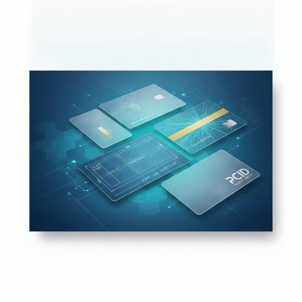
Artwork Requirements for Plastic Card Printing - Plastic Card ID
Getting your artwork right before sending it to print is one of those things that sounds simple until it isn't. A logo that looks crisp on a computer screen can print muddy. A background that seems perfectly dark can wash out under laminate. Colors shift, edges bleed, and text that fits comfortably on a monitor suddenly crowds the card face in ways nobody anticipated. Understanding artwork requirements for plastic card printing before you submit your files saves time, money, and frustration - and it's the difference between cards that impress and cards that embarrass.
Plastic Card ID has worked with more than 100,000 customers across the United States over the past 25 years, and the most common source of delays in card orders is artwork that arrives unprepared. Not because clients don't care - they care enormously - but because plastic card printing has specific technical demands that differ from web graphics, document printing, or even standard offset print work. This page walks you through everything you need to know to submit artwork that prints beautifully, on time, every single time.
| Specification | Requirement | Why It Matters |
|---|---|---|
| Card Size (CR80) | 3.375" x 2.125" | ISO 7810 standard - same as a credit card |
| Resolution | 300 DPI minimum at final size | Prevents pixelation and blurry print output |
| Color Mode | CMYK | RGB colors shift when converted for print |
| Bleed | 1/8" (0.125") on all sides | Prevents white edges after die-cutting |
| Safe Zone | 1/8" inset from trim line | Keeps critical content from being cut off |
| File Format | PDF, AI, EPS, or high-res TIFF/JPEG | Ensures file integrity and accurate color rendering |
| Fonts | Embedded or converted to outlines | Prevents font substitution errors in output |
Card Dimensions and Document Setup
 Every standard plastic card follows the CR80 format - 3.375 inches wide by 2.125 inches tall, 30 mil thick. This is the ISO 7810 standard, the same footprint as any credit card in your wallet. When you're setting up your artwork document, starting with the correct canvas dimensions is non-negotiable. Build your file at exactly 3.375" x 2.125" before adding bleed, or build it with bleed included at 3.625" x 2.375". Either approach works, but your printer needs to know which one you chose.
Bleed extends the background art beyond the card's trim edge so that when cards are cut, no white border appears along the sides. Think of it as a safety buffer - the press doesn't cut with surgical perfection, and a millimeter of variance in either direction can expose bare PVC if your background doesn't extend past the edge. CPE recommends 1/8" bleed on all four sides as the standard. Some printers accept 1/16", but 1/8" gives you real insurance.
Understanding the Safe Zone
The safe zone, sometimes called the "live area," is the space where critical design elements - logos, names, phone numbers, barcodes - should live. Place everything important at least 1/8" inside the trim line. This isn't just about cutting variance. Magnetic stripes, chip placements, and signature panels all occupy specific zones on the card face, and artwork that creeps into those areas will either print poorly or interfere with card function.
A common mistake is designing to the edge of the card canvas without accounting for safe zones, then wondering why the finished card looks cramped or why text is partially obscured. Build in breathing room intentionally. A well-spaced card reads faster and looks more professional than one where elements compete with the borders for attention.
Die-Cut and Non-Standard Shapes
Standard CR80 cards have rounded corners - radius 3/32" is typical. If you're ordering custom die-cut shapes, specialty rounded profiles, or novelty card forms, your artwork template must match the die path exactly. CPE can supply custom die-cut templates when you're ordering specialty card shapes. Never design to a generic rectangle if the finished card will be cut to a different profile.
Die-cut cards require extra bleed consideration because the cut path is more complex. Any background color or pattern should extend generously beyond the die line. For intricate shapes, ask for a layered template showing the die path, bleed zone, and safe zone as separate layers so you can design with full visibility of where cuts will land.
Setting Up Dual-Sided Artwork
Most card programs print both sides. When building a two-sided file, keep front and back as separate pages or separate files, clearly labeled. The back of a card often carries barcodes, magnetic stripe instructions, terms of use text, or loyalty program details. Never mirror your front-side artwork to use as the back - this causes orientation errors that are expensive to catch after production has started.
For cards with magnetic stripes, the stripe runs along the back of the card, approximately 0.223" from the top edge. If your back design has background elements that extend across the stripe zone, keep in mind the stripe itself will be visible as a dark band. Design your back layout to work with the stripe, not fight against it.
Resolution, Color Mode, and File Formats
Resolution is the silent culprit behind most print disappointments. A logo that looks perfectly sharp on a 4K monitor may have an actual resolution of only 72 DPI - screen resolution, not print resolution. When that image is processed for plastic card printing, it appears pixelated, soft, or blurry. The rule is straightforward: all raster images must be 300 DPI at final print size. If you're scaling artwork up from a small source file, resolution drops proportionally, and no amount of software sharpening genuinely recovers it.
Color mode is equally critical. Computer screens display in RGB (red, green, blue) - a light-additive system that can produce vivid, luminous colors that simply don't exist in the print color gamut. CMYK (cyan, magenta, yellow, black) is how printing presses and card printers apply ink or dye to physical surfaces. When an RGB file is converted to CMYK without proper management, colors shift - sometimes subtly, sometimes dramatically. Bright greens go olive. Electric blues go dull. If your brand colors matter, convert to CMYK yourself and evaluate the result before submitting.
Accepted File Formats
PDF is the gold standard for print-ready artwork, and for good reason. A properly exported PDF embeds fonts, preserves vector artwork, locks in color profiles, and packages everything into a single portable document. AI (Adobe Illustrator) and EPS files are also excellent choices if you're working in a vector environment. High-resolution TIFF files at 300 DPI work well for photographic artwork. JPEG is acceptable when exported at maximum quality, but avoid over-compressed JPEGs - compression artifacts become visible in print at card size.
Formats to avoid include low-resolution PNG files exported from web graphics, Word documents, PowerPoint slides, and screen captures. These sources almost never meet print resolution requirements and often carry RGB color profiles. If your artwork only exists in one of these formats, CPE may be able to advise on how to work with what you have, but the safest path is always starting with a proper print-ready file.
Vector vs. Raster Artwork
Vector artwork - built in Illustrator, Corel Draw, or similar tools - uses mathematical paths rather than pixels. That means logos, text, and geometric shapes stay razor-sharp at any size. Vector files are ideal for card artwork, especially for text and clean logo elements. If your logo exists as a vector file (.ai, .eps, .svg), use it. If it only exists as a JPEG pulled from your website, you're working with a raster file, and resolution limitations apply.
Many professional card programs use a hybrid approach: vector-built logos and text over raster photographic backgrounds. This works well, provided the raster elements meet resolution requirements. When you package the file as a PDF with the vector elements intact, they print at true sharpness regardless of final output resolution - giving you the best of both worlds.
Pantone and Spot Color Considerations
Pantone (PMS) colors are standardized ink formulas used widely in brand identity. However, most plastic card printing uses the four-color CMYK process rather than spot inks, which means Pantone colors are approximated through CMYK blends. Some colors - particularly certain bright oranges, electric blues, and vivid purples - have significant visual difference between their Pantone original and their CMYK equivalent.
If brand color accuracy is a priority, request a color proof before approving full production. Understanding the CMYK equivalent of your Pantone colors ahead of time - and adjusting if necessary - eliminates unpleasant surprises. Plastic Card ID works with clients to flag significant color shifts during artwork review so you can make informed decisions before cards go to print.
Text, Fonts, and Legibility Standards
 Text on plastic cards is a unique challenge. You're working on a 3.375" x 2.125" surface - there's no room for paragraphs, and even short strings of text demand careful sizing and placement. Minimum recommended font size for body text on a card is 6pt, but realistically, anything below 7pt becomes difficult to read without strong contrast between text and background. For critical information like phone numbers, website addresses, or card numbers, stay at 8pt or larger whenever layout allows.
Font weight matters too. Ultra-thin or hairline fonts look elegant on screen but may not reproduce cleanly in print, especially at small sizes. Medium to bold weights hold up better. Serif fonts can work beautifully on card designs, but very fine serifs at small sizes may bleed slightly during the print process, making them appear heavier than intended. Test your font choices at actual card scale before committing to production.
Embedding and Outlining Fonts
When you send a file to a print service and that file references fonts installed on your computer, the recipient's system needs the same fonts to display and print the file correctly. If the font isn't available, software substitutes a default font - and your carefully chosen typeface gets replaced with something generic. Converting all text to outlines eliminates font dependency entirely. In Illustrator, select all text and choose Type > Create Outlines. In InDesign, fonts can be embedded during PDF export.
Once text is converted to outlines, it becomes a vector shape and cannot be edited. Always save a working copy of your file before outlining, so you can return to editable text if corrections are needed. When submitting final print-ready files to CPE, outlined or embedded fonts are required to guarantee that what you designed is exactly what prints.
Contrast and Background Considerations
White text on a light yellow background. Dark navy text on a black background. These are legibility failures that appear surprisingly often in submitted artwork - they look acceptable on-screen because monitor brightness compensates, but in print the contrast disappears. For any text on a card, aim for strong contrast ratios. White or light text on dark backgrounds works well. Dark text on white or light backgrounds is reliable. Avoid placing text over busy photographic backgrounds without a contrasting text box or drop shadow.
Clear and frosted cards introduce their own contrast challenges. Since the card substrate itself is transparent or semi-transparent, artwork must be designed knowing the background will be visible through the card. Colors print differently on clear PVC than on white, and whites specifically may not appear as solid. Plastic Card ID can discuss artwork preparation specifically for clear and frosted card stock if your program calls for them.
Barcodes, Magnetic Stripes, and Encoding Zones
Functional card elements - barcodes, QR codes, magnetic stripes, smart chip contacts - have specific placement and design requirements that artwork must respect. A barcode that prints over a dark background won't scan. A QR code that's too small will fail most readers. These aren't aesthetic problems; they're functional failures that make cards useless regardless of how attractive they look. Planning for functional zones early in the design process is far easier than retrofitting a design around them afterward.
For barcode applications, the standard is a white or very light quiet zone - clear space - surrounding the barcode on all sides. The bars themselves must print in high contrast, typically black on white. Minimum quiet zone width is typically 10 times the narrowest bar width. For 1D barcodes like Code 128 or Code 39, vertical clear space above and below is equally important. QR codes need a quiet zone of at least 4 module widths on all sides to scan reliably.
Magnetic Stripe Placement and Artwork
HiCo and LoCo magnetic stripes are applied to the back of the card during manufacturing. The stripe occupies a defined horizontal band across the back face. Artwork behind the stripe area will be partially covered by the stripe itself, so design the back of your card knowing the stripe will be a visible dark band. Text and graphic elements placed in or just below the stripe zone may print partially obscured.
HiCo (high-coercivity) stripes are recommended for most applications because they're more resistant to accidental demagnetization from everyday sources like phone magnets and bag clasps. LoCo stripes are lower cost but more vulnerable to data loss in field use. Your card artwork doesn't change based on stripe type, but knowing which encoding standard your card readers require helps ensure you order the right stripe specification from the start.
Smart Chip and RFID Zones
Smart chip cards have a contact pad - that gold rectangle visible on the front of chip cards - positioned in the upper left quadrant of the card face. Artwork in this zone will be obscured by the chip module. If your card design includes a smart chip, leave the chip zone clear in your artwork. The module itself is not part of the printable surface. RFID and proximity cards contain an embedded antenna and chip that are invisible from the outside, so they don't require specific artwork clearance zones in the same way.
MIFARE DESFire and other advanced contactless smart card formats, like those used in hotel key card programs and casino player card systems, are invisible in the finished card appearance. However, if you're encoding data onto these cards, encoding specifications need to match your card reader infrastructure precisely - that's a coordination conversation separate from artwork, but one where CPE can guide you through the requirements.
Call Us About Your Card Specifications
Reach the Plastic Card ID team at 800.835.7919 if you have questions about how functional card elements should be reflected in your artwork setup. Whether you're printing straightforward loyalty cards or managing a complex access control and membership program, getting the specifications right before artwork is finalized saves production delays.
Common Artwork Mistakes and How to Avoid Them
Even experienced designers submit files with issues that require correction before printing. The most common problems aren't random - they follow predictable patterns, which means they're preventable. Running through a pre-submission checklist before sending files catches the majority of problems before they cost you time or a reprint. A few minutes of review can save days of back-and-forth and keep your card program on schedule.

Many of the most costly mistakes happen not in the design phase but in the export phase. A beautifully prepared Illustrator file can still produce a problematic print-ready PDF if exported with incorrect settings - RGB color profile, low-resolution raster effects, missing bleed. Understanding what good export looks like is as important as understanding what good design looks like.
Pre-Submission Checklist
- Document size is 3.375" x 2.125" (CR80) with 1/8" bleed added on all sides
- Color mode is set to CMYK throughout the document
- All raster images are 300 DPI at final print size
- All fonts are outlined or embedded in the exported PDF
- Critical content is within the 1/8" safe zone from the trim edge
- Background art extends fully to the bleed edge - no white gaps
- Barcodes and QR codes have adequate quiet zones on a white or light background
- Front and back files are clearly labeled as separate documents or pages
- Magnetic stripe and chip zones are respected in back-of-card artwork
- File format is PDF, AI, EPS, or high-resolution TIFF
Why RGB-to-CMYK Conversion Surprises Happen
RGB's color gamut is wider than CMYK's - it contains colors that simply cannot be physically reproduced with ink on a substrate. When conversion happens automatically during print processing, the software makes its best approximation, which isn't always what you'd choose. Vivid neon and fluorescent tones are the most susceptible to significant shift. Proofing CMYK output before full production runs is particularly important when your artwork relies on bold, saturated colors for visual impact.
The fix is straightforward: convert your document to CMYK in your design application before exporting, then view the result and adjust individual colors that shifted unacceptably. Building CMYK-aware color palettes from the start of your design process, rather than designing in RGB and converting at the end, gives you much finer control over the finished printed color.
Low-Resolution Logo Sources
A website logo is almost always 72 DPI - optimized for screen display, not print. When that logo is placed into a card layout and the file is processed for print, the logo prints soft and pixelated against otherwise sharp card elements. Always request vector source files from your designer or branding team when preparing artwork for print. If a vector version genuinely doesn't exist, the logo may need to be recreated in vector format.
Recreating a logo as a vector from a reference image is a standard graphic design service - it's not complex work, but it does require someone who works in a vector application. If you need assistance, CPE can point you in the right direction. Don't allow a low-resolution logo to compromise the quality of an otherwise excellent card design.
Working with Plastic Card ID on Your Card Program
The difference between a card supplier and a strategic partner shows up most clearly in moments exactly like artwork preparation. A supplier takes your file and runs it. A partner looks at your file, flags issues before they become problems, and works with you to get it right. Plastic Card ID has built its reputation on the latter approach - and with more than 50 million cards sold to over 100,000 US customers, the depth of experience behind that approach is hard to overstate.
Whether you're running 50 cards a month for a small business loyalty program or managing a large-scale membership or access control deployment, the artwork standards remain the same. What changes is the complexity of the design, the number of variable fields, the encoding requirements, and the speed at which you need cards produced. Plastic Card ID scales with you - blank CR80 stock for in-house printing, fully custom printed cards in any quantity, printers from Evolis, Zebra, and Fargo, and everything in between.
Card Types That Benefit From Professional Artwork Prep
Gift cards, loyalty cards, membership cards, employee ID badges, hotel key cards, casino player cards, event credentials, RFID access cards - every card type has its own functional requirements that artwork must accommodate. Gift cards that live on retail peg hooks need front designs that sell the program at a glance. Employee ID badges need to balance photo placement, name, title, and department information in a compact space. Hotel key cards need to work with magnetic or RFID encoding while remaining visually on-brand for the property.
Each category has nuances, and approaching each one with the right artwork preparation makes execution smoother and results stronger. Retailers who shift from paper punch cards to professionally designed plastic loyalty cards consistently see engagement improvements - the physical quality of the card signals to the cardholder that the program has real value. That signal starts with how the card is designed and printed.
In-House Printing vs. Pre-Printed Cards
Many organizations manage two distinct artwork tracks: a static base design that's pre-printed on card stock, and variable personalization data (names, ID numbers, photos, barcodes) that's printed in-house on a card printer. Blank PVC cards with a pre-printed background get loaded into Evolis, Zebra, or Fargo printers for individual personalization - giving you total control over data while maintaining a polished branded appearance.
For in-house printing, artwork for the card printer must match the printer's color profile and supported color mode. Most desktop card printers use dye-sublimation or resin thermal printing with YMCKO ribbon sets. Understanding your printer's capabilities and limitations shapes how you design artwork for that layer. CPE carries full ribbon and supply inventories for all major card printer brands, so you have everything needed to keep your in-house program running smoothly.
Getting a Quote and Starting Your Order
Ready to move forward? Connect with Plastic Card ID directly at 800.835.7919 to discuss your card program requirements, review artwork specifications for your specific card type, and get a quote tailored to your volume and production timeline. The team has seen virtually every artwork scenario imaginable and can advise on file preparation, card type selection, and encoding requirements quickly and clearly.
There's no complicated procurement process to navigate. Share your requirements, share your artwork or describe what you're creating, and get straightforward guidance from people who have been doing this for over two decades. Orders of any scale are welcome - from small-run starter programs to high-volume ongoing supply relationships.
Trust Plastic Card ID to guide your card program from artwork through delivery. Call 800.835.7919 today and put 25 years of plastic card expertise to work for your organization.
Previous Page